Quick Summary
Good trade show graphics start with one clear goal and one message a passerby can absorb in three seconds. Keep text readable from about five feet away, build files at full print size, and choose materials that suit the booth environment.
- Decide what attendees should do after seeing the booth before choosing colors or fonts.
- Make headlines readable from about five feet away and leave room around the main image.
- Build artwork at full print size and set image resolution for the final print scale.
- Choose a substrate suited to the environment, since booth floors and lighting can fade or sag weaker materials.
- Compare file size against final print dimensions before submitting to catch soft-printing files.
Table of Contents
- Start With a Clear Goal and a Three-Second Message
- Trade Show Graphic Design Tips for Readability and Visual Impact
- Large-Format Trade Show Graphics: Materials, Resolution and File Prep
- Frequently Asked Questions
Start With a Clear Goal and a Three-Second Message
Last Updated: November 7, 2026
Most trade show booths fail before the first attendee walks by. The pattern is familiar: a booth crowded with text, no clear purpose, and a headline nobody reads. Good trade show graphics start with one goal and one message that a passerby can take in within three seconds. Once that message is clear, every booth detail should reinforce it, including promotional pens for trade shows that carry the same idea beyond the display.
Before you pick a color or a font, answer two questions:
- What should attendees do after seeing the booth?
- What single idea do you want them to remember?
Watch out: Trying to fit your full product list onto one graphic is the most common mistake. Attendees will skip it entirely.
Trade Show Graphic Design Tips for Readability and Visual Impact
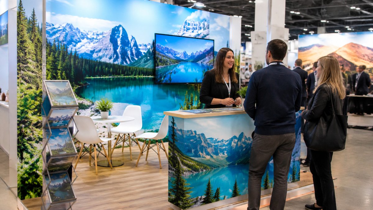
Readability decides whether trade show graphics work. A headline should be readable from about five feet away, and the layout should leave room around the main image. Use solid colors behind text, keep fonts large and simple, and let one strong visual carry the message. Once the design is done, protecting those finished graphics matters too, which is where a laminator like the Vision Sign Tools Lf1700ha Laminator earns its place.
Large-Format Trade Show Graphics: Materials, Resolution and File Prep
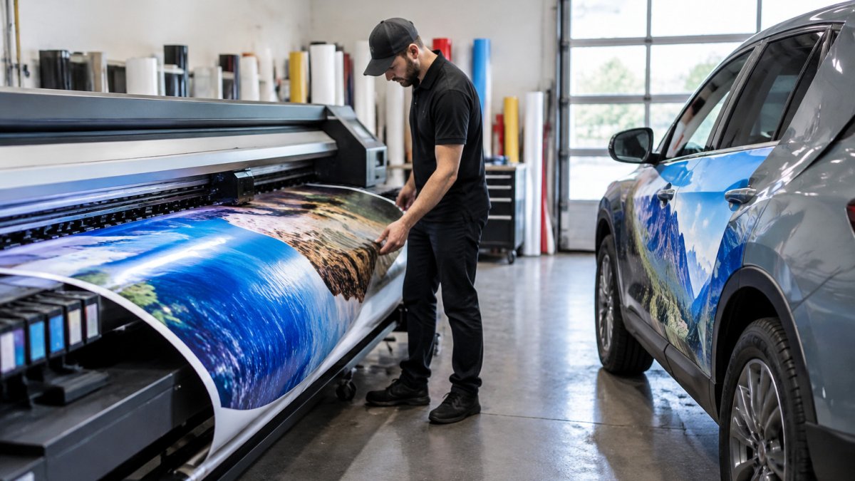
Large-format graphics need the right file settings before printing. Build artwork at full size, and set images to a resolution that holds up at print scale, since low-resolution files look blurry on a multi-panel wall. Choose a substrate that suits the environment: booth floors and hall lighting can fade or sag weaker materials. Browse wide-format film and vinyl options from Mactac to compare materials for your next display, and review the Roland EU2-1000MF UV flatbed if you print directly onto rigid boards.
A common mistake is sending a file that looks fine on screen but prints soft. Check the file size against the final print dimensions before you submit it. Many shops find that a quick prepress check saves reprints.
The article’s key file-prep and material points are summarised below.
| Factor | Guidance | Why it matters |
|---|---|---|
| Artwork size | Build at full print size | Avoids scaling problems |
| Image resolution | Set for print scale | Low-res looks blurry on multi-panel walls |
| Substrate | Match the environment | Booth floors and lighting can fade or sag weaker materials |
| File check | Compare file size to final print dimensions | Catches soft-printing files before submission |
Ready to make your next booth stop traffic? Talk to the Pony Graphics team about materials and production, and see how the support options for printing equipment keep your rush orders moving.
Frequently Asked Questions
How do you design effective trade show graphics?
Start with one main message that a passerby can read in about three seconds, then build the layout around it. Use a large headline, a single strong image and plenty of negative space so the graphic stays legible at viewing distance. Keep your brand colours and typography consistent with your other marketing materials so attendees recognize you across the show floor. Test the layout by viewing a printed proof from five feet away before approving the final print run.
What colours work best for trade show graphics?
High-contrast combinations such as dark text on a light background, or white text on a deep brand colour, are easiest to read under mixed show lighting. Limit your palette to two or three colours and use solid colour fields rather than busy gradients, which can look muddy under exhibition hall lights. Check how your brand colours print on the specific material you choose, because screen colours and printed colours often differ.
How do you prepare artwork for large-format printing?
Set up your artwork at full print size and use a resolution that suits the viewing distance, since large graphics are seen from further away and usually need less resolution than a magazine page. Keep all text and logos as vector files where possible, and embed or outline fonts before sending. Send a completed file checklist to your print provider with the final dimensions, bleed, colour profile and material choice so the job is not delayed at prepress.